

What do you think about the market? The market has been doing pretty good, huh? The market got hammered today. The market reacted poorly to the latest news out of Washington. The market loves the new legislation in Washington.
You’ve almost certainly heard your friends say these phrases or seen them in a headline. When I get asked what I do for a living—and assuming I answer honestly—I can guarantee you the next question coming is a version of the following: So what do you think of the market?
The “market” in this context takes on an all-encompassing, almost omnipotent quality to it. But what are people really talking about when they talk about the “market?”
In the case of the media, they are almost certainly referring to the Dow Jones or maybe the S&P 500 Index*. The Dow represents 30 large stocks in the U.S. whereas the S&P 500 represents, well, 500 large stocks in the U.S. For a serious investor, the Dow is pretty much worthless while the S&P 500 is at least a decent representation of the general movement of large, U.S. stocks. The two do move together fairly often, but because the Dow is so much less diversified, a large move from one or two companies within may make the two indices deviate from one another.
The more important point is that in either case we are talking about one asset class in the context of the global markets. Across the world, there are somewhere on the order of 40,000 listed companies (that is, publicly traded and listed on an exchange). On a pure market capitalization basis, the S&P 500 is close to 35-40% of the world market capitalization. It makes sense as the “go-to” proxy for the market, but by no means is it the entire market. Over time it is likely a decent measure of the market’s direction, but there can be periods where there is significant deviation from other asset classes. Take the beginning of this year and really the last six months overall.
Here are the returns for various stock asset classes across the world for the last three-, six-, and twelve-month periods.
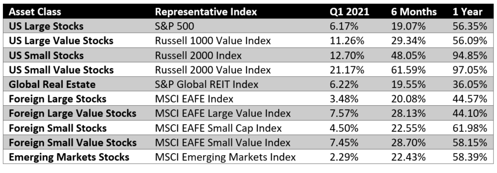
Directionally, all are the same. The “1 Year” column is basically a snapshot of the recovery since the initial market panic of March 2020. Big returns across the board, but there are still significant differences, particularly amongst small stocks. That same pattern is amplified even further when you look at the past six months. Then, in the past three months, you start to see both small and value stock asset classes really outperforming their large counterparts. The “market” as represented by the S&P 500 isn’t giving us the full story.
Why Does it Matter?
There has been a story gaining momentum lately that we’re in a “market bubble.” It’s often tossed around as if it’s a fact that a crash is inevitable. That kind of thinking can be very harmful to us as long-term, diversified investors.
First, it is technically true that a downturn is inevitable, but we don’t know the timing and it could be years before it happens—downturns are a part of long-term markets. As an example, recent “bubble” talk has been happening for more than six months at this point. If we took that seriously and sat on the sidelines for the last six months, we’d have missed 25-35% in returns! It doesn’t do us much good to avoid a 20% downturn if we miss all that upside before it comes.
Second, a downturn or correction in the S&P 500 is not the same as a downturn in the global market. Yes, stock returns tend to be correlated, but not perfectly. We don’t have to look too far into history to find a significant time period where this was relevant.
The “Lost Decade”
From September 1999 through September 2009, the S&P 500 had a negative return of 0.15%. Over ten years, if you had just bought and held an S&P 500 index fund, you would have nothing to show for it (and technically you would have less than nothing because of inflation). However, global markets did just fine. They returned a little less than the historical average thanks to being bookended by the Great Recession, but grew significantly, nonetheless.
We need to be careful about conflating what we are familiar with (big U.S. companies) with the entire investable universe. Your stock portfolio is not just the S&P 500 and with good reason. There is a literal world of opportunity for us in our portfolios and it’s easy to be led astray by the focus on just one part of our diversified portfolios.
*This choice is often based on the context and with regards to sensationalism. This is why a big market move is reported in actual numbers with the Dow and just percentages with the S&P 500. It’s a lot more fun to say the Dow dropped 500 POINTS!! than that the S&P was down 1.5%.

